If you think the same as me, GNOME 3.38 will introduce a change that you will like. NowadaysWhen we click on the Ubuntu application launcher, we are presented with two tabs: one where we see all the available applications and another with the frequent applications. Personally, I think that the second option messes everything up a bit, more if we consider that we have the dock, and the developers must agree with me, because this tab will disappear in the coming months.
The project developers are working on two changes, the first of which is to offer only the option that shows us all the applications. As before, the icons will be placed in alphabetical order, although we can modify them at will, or at least create folders to group them as we like best. Another change they are working on is how many apps will show on each page.
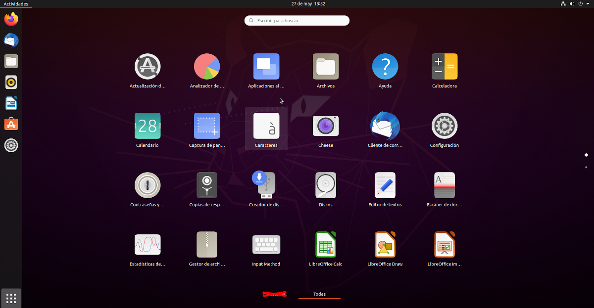
GNOME 3.38 App Launcher will show more apps on bigger screens
Although they have not decided the number yet, GNOME 3.38 will not always show the same applications. The exact number of apps that will be displayed will depend on the size and resolution of the screen. If we have a 15.6 ″ screen with 1920 x 1200 resolution we will see more icons than if we work on a 10 ″ screen with 1376 x 768 resolution, all thanks to a new layer manager. To achieve this, many changes will have to be made at the code level, but it also paves the way to improve things and make everything more fluid.
In a third less important change, as we see in the image that he shares OMG! Free!, now the top and bottom margins are much larger, something that we will have to wait a few months to see if it ends up being this way in Ubuntu 20.10 Groovy Gorilla or keeps the current image. Looking at the previous screenshot, we must not forget that Ubuntu uses GNOME, but Canonical reserves some makeovers as a dock that occupies the entire left part.
As for the folders, there is a fourth change: now they are 3 × 3 applications, which makes a total of 9. If we want to see a tenth application, we can access it by going to a new page.
GNOME 3.38 is coming By the end of September in its stable version and it is the graphical environment that Ubuntu 20.10 Groovy Gorilla will include in October of this year.
My God, how scary
Damn, if the problem is not that it shows more or fewer icons, the problem is that the launcher occupies the entire screen. On a 10 ″ screen (ex: tablet) that is fine, but on a 24 ″ monitor it is plenty.
I don't know who or who makes the decisions on the design of the desk, but they should fire them all. The only reason I'm able to use Gnome-Shell is because of the extensions that pave the way for me.
That is why I always use the application menu extension, the other thing I hardly use, when I have no choice but to search for an application that is not categorized, it is nonsense. The launch should open on a screen or simply replace it with the menu that makes the most sense. and the other leave it for small or tactile devices.
I think that is why it will adapt to the size of the screen, the one with the wider edges I think is due when it is used with large screens and make the icons more centered since it is a full screen menu
That still doesn't fix the problem. It is still absurd to have to move all over the screen to open an application, and if you use a touchpad the experience is disastrous and traumatic.
One of the things that I miss about Unity is its application dashboard, it would come out of a corner and occupy just enough (although it even let you put it in full screen, but it already gave you more options), I hope Canonical would give it to create something thus in extension mode for GS.
A smart solution would be to give the end user the opportunity to choose their own customization and configure their Dash, not all of us have the same taste. This menu is very current and beautiful but it is difficult to choose between so many apps together, (the view) must have a classifier, in unity it was easier.
A smart solution would be to give the end user the opportunity to choose their own customization and configure their Dash, not all of us have the same taste. This menu is very current and beautiful but it is difficult to choose between so many apps together, (the view) must have a classifier, in unity it was easier.
When opening a folder that contained images and videos, before I had the option of sorting them either by type, by size or alphabetically ... now I only have the options: new folder, new document, paste and properties, the mentioned options never appear. Anyone know if they can be ordered like before? Thanks
You are looking in the wrong place. Instead of the left click menu, press the arrow button on the top bar; there you will find the options to sort by type, name, size and modification date.