
The online music service Spotify continues to improve its client on Linux with small changes that this time affect a controls redesign. The new modifications introduced focus on the version desktop with y are not available to all usersas it is proof of concept.
In reality, the changes are so small that unless you have both versions in sight you will not notice any difference. Even being so subtle, the modifications have not gone unnoticed and the first complaints among users have already arisen.
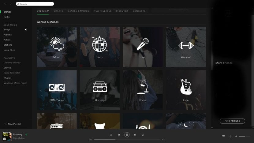
The Spotify Linux client is undergoing a series of small modifications in the appearance of its interface that improve the main controls of the application, giving an appearance of more cleaning to the general set. In the case of Linux, remember that we are talking about an experimental desktop application, and not about a stable version and with support as the own client that the Windows system has. Even so, there are times when this version is used to carry out the first tests and designs.
Hereinafter, the icons Volume control buttons, playlists and available devices (such as a connected Chromecast) will be located in the lower right of the application to be more available. To do this, it has lengthened the application bar, also giving a bigger size to the image of the album that we are listening to. The name of the song and the artist will remain unchanged for the moment, in line with the rest of the bar. On the other hand, the "new playlist" button is much more prominent in the set, partly also thanks to its new label.
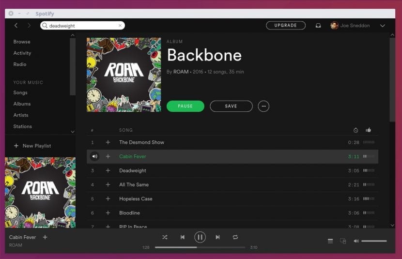
Finally, we see some Color change regarding the background of the application bar, which is now black, and the disappearance of the icon that accompanied the categories. As always, a change that is about tastes and that will undoubtedly be talked about.
Source: OMG Ubuntu!