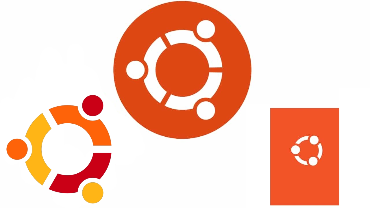
Ubuntu has a new logo, and it's already the third. The famous Canonical project has been renewed over the years, and not only on a technical level, but also on an aesthetic level. And, just as many other companies, organizations, brands, etc. have done, they started with more complex logos and over time have become more and more minimalist. An example is in the Apple apple, which has now been reduced to its minimum expression.
In this main image you can see the three logos that have been used so far, and here we will tell you a little history about this distro.
Surely you will remember those years in which Debian was somewhat complicated to use and some developers came up with the wonderful idea of creating a project that would facilitate that, a Linux for humans, that's how they presented it. The adventures of this distro began in 2004, with the Ubuntu 4.10 Warty Warthog version arriving in October of this year, 17 years ago.
That logo that was initially used has evolved to what we present today. Although it retains the initial orange and white color scheme to maintain the essence. The only thing that can be seen is that it has been simplified to be more minimalist.
- El iconic CoF (Circle of Friends) symbolizing this distro was multicolored, represented by different shades of orange.
- From that multicolor it would pass to a circle in orange and white tone. This is the one that has been used in recent years.
- Now, surprisingly, a further step has been taken. And she has put the circle on a rectangular orange background and with the circle even simpler, becoming simply three strokes and three circles, without the grimaces or indentations.
Simplifying the Ubuntu logo makes it more agile, as well as sophisticated. In addition, it has been placed more coherently, with the heads more centered, since in the previous ones if you imagine that it is a hug between three people, the arms appeared too far ahead of the head, almost as if the head was tilted towards back, as if looking up. Now there is more of a feeling that they are looking at each other's faces.
La Ubuntu's own brand has also suffered a transformation, now reducing its weight and going from a bold letter to a lighter and more elegant one, with a different capital U.
As to why Canonical has decided to update the logo of Ubuntu, they have simply argued that just as technologies evolve over time, so must the brand that represents it.
The left-most logo with four dots was never Ubuntu's logo (the logo has always had three dots). And the right-most logo (the "new" one) specifically doesn't have the correctly shaped orange rectangle around it.
Thank you